Design Trends in 2014
Design trends in 2014
A new year is here, and with it, new design styles and trends to help you keep your website looking up to date, modern and fresh! This year the buzzword you need to be familiar with is FLAT.
Over the past year here at LunaWebs we have been viewing our website traffic analytics carefully, and what we have seen is the incredible growth of mobile browser traffic coming to our websites. With a smart phone in everyones pocket or purse, it has become more and more common for people to browse the web, make purchases, and communicate with a mobile phone rather than using a desktop computer. Because of this huge shift in traffic, it is becoming necessary to design your website with mobile traffic in mind, and using these new "flat" design" techniques can help you increase your traffic.
What happened in 2013?
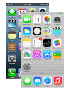
 At the end of 2012 Windows 8 from Microsoft was released to the public, and in 2013 we saw the release of IOS7 by Apple for the iPhone5. Both Windows 8 and IOS7 marked a major shift in design language for both companies. In the previous version of the iPhone Operating System, IOS6, the design language leaned heavily on using textures and gradients, the fonts felt thick and clunky, and there were drop shadows everywhere for no apparent reason. The new version has dropped all these unnecessary embellishments in favor of a cleaner, more streamlined interface. On windows phones using the Windows 8 interface, users are accustomed to seeing brightly colored flat square boxes, called live tiles, which use minimal text and small vector icons to direct user navigation, and the use of full screen engaging photography is everywhere.
What Does Flat Design Mean For Me?
Flat design is becoming the design industry standard not just on mobile phone interfaces, but on websites everywhere. It strips out all unnecessary information and allows your users to focus on the content of your site. Flat design is a great way to let your users know you care about keeping your website up to date, by using the same design styles that your customers use everyday on their mobile phone.
5 Quick Flat Design Tips
- Minimalism - if you have too much text on your site, get rid of it. Traffic analytics show that users do not read large paragraphs of text, they simply scan the page quickly for the information they need and move on.
- Photography - Because flat design can feel very empty at times, the key to getting an emotional response on your website is to use great photography in large sizes.
- Icons - Use icons to direct your traffic to the appropriate place. Instead of a text link use a small envelope icon for email, a magnifying glass for search bars, or arrows to signify buttons that can be clicked on.
- Color - Just because the style is called "flat" doesnt mean you cant use bold colors! Giving your site a pop of color by using brightly colored buttons on a neutral background is a great way to call attention to important areas.
- Lots of Padding - Padding is the space you leave around text, pictures or buttons. Previous to the flat design style, designers would try and cram as much information onto the page as possible, give your design room to breathe, and your users will love you for it.


