
The Anatomy of an Infographic
Infographics are one of the most effective ways to present information and make it go viral. That is possible thanks to our brain; it naturally prefers to see colors and shapes than a monotone black and white paragraph. So whatever you need to communicate, make it in a clear, creative and clutter-free way, you'll be able to teach your reader more because you have already captured their attention with compelling graphics and colors.
Keep in mind these tips next time you create an infographic, and you'll see higher engagement from your readers.
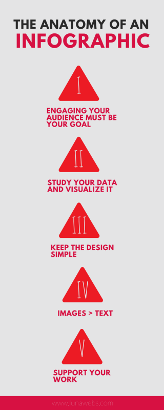
1. Engaging your audience must be your goal. Data visualizations are one of the best received and shared content types.
2. Study your data and visualize it. (Start with a blank page) Think of colors and shapes, and then visualize your data in between them.
3. Keep the design simple. Choose a theme color, and keep it simple! Choose colors that compliment each other and make that no more than 3 colors total. Same thing applies to different fonts and sizes.
4. Images > text. Always. If you can use an icon instead of the word, do it. Images are not only to beautify your work, they're also there to get your message across.
5. Support your work. If what you're doing is teaching facts or objective information on your infographic, then provide your sources and keep your credibility safe.
Leave a comment
To leave a comment, please log in / sign up